Wednesday 30 June 2010

Simon Says Stamp - "Check It Out"

This week our challenge at Simon Says Stamp challenge is to CHECK IT OUT!!!! Use checks, plaid, gingham, etc. on your creation!!!!!  'Check out the other DT's fabulous creations and visit their blogs to get more info about their projects.

 I coloured the beautiful 'Shy Willow' with distress inks. The edges of the image are stamped with a Basic Grey flourish stamp and heat embossed using clear power. I then inked the edges using blue and green inks. 
The papers are Basic Grey's Archaic and I've used Prima pearls, stamped the piece at an angle ith a Tim Holtz script stamp (then cleverly more or less covered it up). The edges are distressed using the Tim Holtz disstressing tool then edged with Stardust stickles. The pearls are Prima as are the two top most flowers and the pearl brad is American accents. All these products are sold at the fabulous Simon Says Stamp store. The netting is some I bought some garlic cloves in, the two larger leaves cut from a Christmas decoration and the other  leaves cut with a Sizzix die.

We look forward to seeing your fabulous creations and don't forget


this fabulous prize is on offer and Heidi will pay the shipping costs.
Photobucket

Tuesday 29 June 2010

Using distress inks with Computer printed digi images


I've had several people ask me how I manage to use distress inks with computer printed digi images. I've emailed a few but decided it would be easier to do a tutorial.

There are several things you can do to prevent the computer ink from running.
  1. Print out your image on draft, or quick copy as it is on my computer.
  2. If you forget, as I frequently do, you can run it under the tap and sluice off all the excess ink, pat it dry with a kitchen towel and leave to dry for a little while.
  3. You can heat set the ink with a heat gun
  4. You can also print your images in advance and leave them a few days for the ink to set. Not a good idea if you are impatient like me.

I printed out three images, two on normal print - one on draft/quick print. This photograph is one of each.
The left is the normal print, the right the quick print which is marginally lighter. Of the two normal print images, one I will heat set, the other I will 'wash'


This is the normal print when water or pale colour is added - the ink runs and I presume this is what you're all experiencing.


You can just about see the ink sluicing away when it is run under the tap 


I pat it dry with a piece of kitchen towel and normally leave it to dry for a couple of hours. For the sake of this tutorial I didn't wait and it wasn't completely dry.


I started adding colour to the images to give you a comparison. I tried to colour the three images simultaneously using the same colour depth, difficult as it is so hot the ink was drying as soon as it hit the paper.
  1. The left image is the one that I heat set with a heat gun, I think the colours are muddier that the other two.
  2. The middle image is the one that I 'washed' slight buckling here as I didn't leave it to dry long enough.
  3. The third image is the quick/draft print one.You lose some of the line definitions when you start colouring but regain these as you start to add more depth of colour.
I would normally use a thicker watercolour paper (Fabriano Classico 5 - 300g/m or 140lb) than I have here but I'm desperately waiting for more to arrive.
Ideally to print the images well in advance is perhaps the best method, other than that try out all of these three and see which suits you the most.

Hope you find this useful and I have also been asked to do a complete tutorial on colouring with distress inks which I shall do using this same image, although I'm pretty sure there are better tutorials out in blogland than I will produce.
Photobucket

Monday 28 June 2010

Here comes Tokyo Girl

The Creative Card Crew wanted and easel card this time and as I used Tokyo boy yesterday I wanted to used Tokyo girl today. These images are digi-downloads from Dewdrop Craftz and such a delight to colour as well as being perfect for teenagers.


I intended to colour in moody Goth type colours, I don't know what happened but she wouldn't let me and I had to colour in these light pretty colours but I still think she has a sassy quality about her. She is coloured with distress inks and the edges are inked with vintage photo. The papers are from the Extreme Volume III CD by Donna at Bearly Mine Designs . The flowers are from Wild Orchid Crafts, the border cut with Spellbinders In Spades borderabilities and the flourishes from a Marianne createability. The inside tag is cut with Spellbinders fancy tags and the sentiment  LOTV. The tag is chipboard, covered with  paper and stamped another LOTV sentiment, tied with fibres and a cross charm attached which I thought matched the cross on Tokyo girl's lapel. The sentiment reads Special Friend but got covered up with the fibre on my attempts to photograph this card, which fought all the way I might add.


 Here is a close up of the image which photographed better that the 
whole card.


Distress Inks used
Skin  -  Tattered Rose/ Antique linen/ Victorian velvet
Hair  -  Mustard seed/ Antique linen
Skirt, stocking, T shirt - Weathered wood
Jacket  -  Peeled paint
Scarf  -  Mustard seed/ dried Marigold

I'm now off to get an ice-cold drink - my outside thermometer reads 
33 degrees C and that's been in the shade all day - summer is here - yippee!!
Photobucket

Sunday 27 June 2010

Sketch and Stash

TRULY SCRUMPTIOUS DT CALL
Just to let you know we are having a DT call over at Truly Scrumptious for  2 new members, so if you'd like to join our happy little band
you can get the details HERE on the challenge blog. 
The closing date is 14th July.


****************************


A quick posting whist I still have internet connection - I've been losing it on and off since Friday night.
I made this card for my grandson's birthday, a perfect image which I'd forgotten about until I saw Mel had used it - thank for jogging my memory hun. It's from Dewdrop designs and called Tokyo boy I also have Tokyo girl (amongst others) and she'll be appearing next.


I've followed the sketch at Sketch & Stash and practically all on this card is either new or as yet unused.
Tokyo boy is coloured with distress ink and the fabulous wall paper (no pun intended - honest) is a freebie from Donna at Bearly Mine designs - thanks so much for that Donna, I knew as soon as I saw this fabulous paper it would be so useful, and it has - sooner than I thought. The blue is also from Donna's CD Designer Extreme Volume III. The letters are from Classic Bold Alphabet by Stamendous and also fairly new and unused.

Right back to commenting before I lose my connection again, hope you're all enjoying this amazing weather.

Photobucket

Saturday 26 June 2010

Time for another challenge at Basic Grey and this week it's a photograph inspirations chosen by me.You can use any aspect of the photograph you like, the colours, the shapes, the fruit, the design - anything  - just don't forget to use at least one Basic Grey product to be in with a chance of winning the fantastic prize of a $25 gift voucher from our fabulous one and only sponsor Simon Says Stamp.

Here is my card - I have to admit I looked at the photo and thought - ooooh what am I going to do with that?
I decide to go with the colours of the fruit and the fresh ice of the fruit cocktail (or whatever it is). My first thought on seeing food is House Mouse - these little mousies love their food, especially fruit. I received this image from my fabulous friend Scoopy Sue, thanks hun, couldn't have done it without you!! I coloured my image with Copics and then decided to add glossy accents to the ice lolly - eeeeek!!! they all went gloopy and horrible, carefully scraped it off and added another 'breed' - same results - they are old and I think must have gone off. Can someone please recommend a good make of glossy accents - not that I will be able to buy them here. Right, binned the first then stamped and coloured another image. The papers I used are from the Obscure range - I liked the colours and the round berry like pattern. I used the MS punch on the corner strips and added leaves, cut with a Woodware punch, and the dew drops to represent the berries. I think the cat thought these were edible as I caught him trying to pull them off - he's in disgrace yet again!!

Copics used
Mice  -  Left mouse the C's   Middle mouse the E50's  Right mouse the E30's
Ice lolly - Strawberry - R00, R20/22/27/29   Orange - YR00/02/04/07 - 
Lemon - Y00/02/06/08
Grass -  G00/G20

Hope you all have a brilliant weekend - it's going to be a scorcher of a day here that's for sure - could just do with that ice lolly!!
Photobucket

Friday 25 June 2010

Mo's Digital Challenge & Stamping for the Weekend

I managed Mo's Digital Challenge again this week. I've not used one of my untouched images as I've been itching to colour Jill Two again and giver her red hair.
I followed the sketch at Stamping for the Weekend and the colours blue and yellow.


I coloured Jill Two with distress inks and inked the edges with  Faded jeans. The papers are Stamping up and the sentiment is Hero Arts and cut with Spellbinders round nesties. Ribbon, flowers, brads are from my stash.

That was short and sweet.

How I have an award (I have others from my very sweet friends, Sue, Wilma and Moni but will do those later)


Meanwhile this is from my sweet adorable friend Hanna
Thank you so much hun, I appreciate that you thought of me.


I find it so difficult passing awards on - I want everyone to have them - SO - will everyone who comments on this post please take it as an appreciation of your taking time and trouble to both visit and leave me a comment.
Photobucket

Wednesday 23 June 2010

Simon Says Stamp - my first DT card !!!

I can't tell you how thrilled I was when I received and email asking me would I like to be a DT member for Simon Says Stamp Challenge - did I hesitate - well yes I did - I sat staring at my computer screen for about 20 minutes in disbelief. Once realisation had kicked in my little fingers flew across the keyboard - I couldn't say YES quick enough.

I've always loved the challenge at Simon Says Stamp and entered each one I possibly could.  Shopping at the Simon Says Stamp store is a delight, the range of goods available is fantastic, it's like entering Alladin's cave, I've always found the service so friendly and efficient and believe it or not I very often receive my goods quicker than I do from Europe and at competitive postal charges also.


Right on to my first DT card, and oh boy - I can't tell you how nervous I was doing this one!! The theme this week is "You gotta have friends" 
and there is a  great prize of $25 to spend in the Simon Says store.


The image is by Penny Johnson, whom we are featuring this week, and it is coloured with Ranger distress inks - I had to use this adorable image - the dog reminds me so much of Chloe - a bearded collie I had, hair all over the place and just so cuddly and lovable. The paper are from the Basic Grey Cappella collection, the  button is also Basic Grey. The borders are cut with a MS punch and the adage ticket is one of Tim Holtz. All the products used are sold at the Simon Says Stamp store except the ribbon - you'll have to go the my ex-local market in Blackburn for that.

Photobucket

Truly Scrumptious DT

Today at Truly Scrumptious we have another fabulous sketch by Sharon and as Wimbledon will soon be starting we have 'Strawberries and Cream' as our optional challenge this week.

Our sponsor the week is the fabulous Whiff of Joy with the lovely Willow with Strawberries image for the lucky winner - how appropriate is that!!


When I saw strawberries as the option this time my mind immediately flew to the charming little House Mousies - they love their fruit, especially strawberries. The image is coloured with Copics and mounted on a frame cut with the Spellbinders Fleur de lis pendant. I used papers from the Basic Grey Marrakech pad, cut the sentiment (Lily of the Valley) with a Fancy tags die and finished with a laser cut butterfly from Anne-Marie Klipp. The butterfly's edges are inked with distress inks and the added pearls are from my stash.

Copics used
Strawberries  -  R00,  R22/ 27/ 29,  Y0000, E04
Leaves  -  G00, G21, YG00, YG63/ 67
Mice  -  E50 & R00 (face, hands, feet and tails) Brown mouse - E31/33/35/37 Grey Mouse - C00/1/2/3/5

Well I wish you all a happy Wednesday - I shall be back later with another posting a little news.


Photobucket

Tuesday 22 June 2010

Clean and Simple

For anyone who say the Fancy and Fussy card I posted on Saturday, this is the Clean and Simple that I intended to finish and post on Sunday morning. One small problem - I lost the image !!!!  No matter - do another, hence the delay. Didn't get much right over the weekend - I did the previous week's Fussy and Fancy challenge not the current week, lost this image and the Shutzenfest I went to on Sunday - wasn't. The Shutzenfest is in July - only a month out!!  What did I go to - can't pronounce it, can't spell it!! It was similar to the Christmas markets but with a summer theme. Lots of stages with entertainment, some tradtional, the obligatory ooompah band, some singing, some dancing, some modern. There were some amazingly beautiful traditional costumes but bird brain here forgot to take my camera. Last but not least lots of food and drink stalls. 


The papers I used are from one of Eline's cutting books I've had for ages and the image one of Eline's babies (available Here and digi images at Squiggly Fly), coloured with distress inks. The sentiment is computer generated and the run through the Swiss dots embossing folder as is the circle behind the image. The border is cut with a MS punch and the ribbon is from my stash.
Photobucket

Monday 21 June 2010

House Mouse #72

This week's challenge at House Mouse  is the lovely Christine's idea! We are to create something NEW !!!
A new Baby, A new House, A new job... anything goes, as long as you use at least one House Mouse & Friends Image on your NEW projects!!!


Come play along because we are being sponsored by Paper Cupcakes
One lucky winner will get 2x dtigital stamps (1 of choice 1 chosen)! How cool is that?


I decided to go for the Clean and Simple look for this card. I embossed the top with the Provocraft Divine Swirls folder, the the bottom with one of the organic flourish borders. The image is Olive a Party, featuring Maxwell and Mudpie and is coloured with the usual Copics. The hearts are cut from Hippie Chick alphabet set from glitter paper and Stardust stickles added to the ribbon on the image. I really don't like the sentiment but wanted to get NEW into it and fully intend to change this, it is computer generated and cut with Spellbinder nesties labels 4 - I think!!!! The ribbon is from my stash.

Now I'm off to clean a pan I burnt - I really shouldn't try to cook and craft at the same time - fatal!!
Photobucket

Saturday 19 June 2010

Eline's baby Is Fussy and Fancy

I wanted to do a couple of cards with Eline's babies, I sorted out my papers, stamps and coloured the images and decided to find a couple of challenges I could enter them into. Fussy & Fancy and Clean & Simple were the two that caught my eye. One would naturally go for Fussy and Fancy for the baby girl and Clean and Simple for the baby boy. Not being one to do things the easy way I decide to do the opposite - the boy for the Fussy and Fancy the girl for CAS. Here is the  fussy and fancy boy card.


The blue spot paper is from my bit box, the blue and yellow behind the images is from one of Eline's cutting books which I've had for quite a while. The images are coloured with distress inks, cut with round nestabilities. The top border is cut with an EK Success punch and I added pearls from the Hobbby House. The leaves are cut with a Woodward punch and the stamens with  Leone Em and  Woodware  punches. I added a ribbon and charm from my stash,  stamped  Baby with Stampendous alphabet stamps,cut  them out and added them with foam tape.
This done I shall now attempt the Clean and Simple baby girl card.

Hope the weather is better where you are than it is here - typical weekend weather, i wouldn't mind but I'm going to a Schutzenfest tomorrow.
Schutzen means protect and Fest firm or solid - what they mean when they are put together - I haven't a clue, but I'm going and I suppose I'll find out when I get there.
Photobucket

Friday 18 June 2010

Mo's Digital Challenge at Friday Sketchers

I've managed to use another of Mo's  as yet untouched images  - this time a winter one so although I find it difficult to think 'snow' in the middle of June I've done a Christmas card - one more off the list I suppose.
They're asking for embossing this weeks at Mo's Digital Challenge followed the sketch at Friday Sketchers.  I must say I found things I thought I'd lost rooting through my box of Christmas stash.


The image is Miki's puppies and coloured with a combination of distress inks and Copics. The fur on Mikki's hat is a mixture of Polar white flower soft and fun flock and the snow is a white glitter, although it looks rather creamy to me. The white and the green band are embossed with the Provocraft Snowdots folder, the backing paper is from the Extreme Volume III from Donna at Bearly Mine Crafts. The smaller snowflakes are cut with an EK Success punch and the larger ones from the Spellbinders create a flake 1.


Well, playtime over - back to grouting.
Hope you all have a brilliant weekend.
Photobucket

Wednesday 16 June 2010

Three Challenges this time

Well times does fly - it doesn't seem like two weeks since the last
lovely hAnglars only challenge. This time we are been asked for shabby chic, which I love.


The papers are from Donna at Bearly Mine Crafts I bought the Designer Extreme Vol III and told Donna that flowers were not my first love, when I got the CD (she posted it Friday and I received it in Germany on the Monday - unbelievable) the paper I immediately fell in love with - this floral that I have used for the background, it is just so beautiful. I followed the fabulous sketch from Everbody Art Challenge which I thought suited the shabby look perfectly. The cute little hAnglar girl is coloured with distress inks, I masked her and sat her on a border from Prima's Build a Frame set. The script paper is also from the same CD, the flourish stamp is Stempelglede, the flower from Papirloftet, the beautiful Pearl cluster was sent to me by my friend America - (love you loads huni!!!), the braid is some I made (braiding tutorial coming up very soon), and the flourishes cut with a Marianne Creatable stencil.  The edges are distressed with the Tim Holtz distressing tool and stickled with Star Dust stickles.I'm also hoping this qualifies for the Nice and Girly challenge af Bunny Zoe's they'll have to throw me out if it doesn't.
I have promised myself I will make the box at the same time I make the card and not end up with dozens of boxes all needing to be made.  I was going to print out the same paper to decorate the box then whilst scrolling through the CD, had the idea of using one of the 'inserts' instead,  I think it works really well.

Well folks, that's all for today - I'm off to grout some of my kitchen tiles - horrible job!! 
Photobucket

WOYWW

It's time for WOYWW again. First I'd like to say thanks for all your lovely comments, I didn't get round to visiting too many of you last week as I was in the middle of tiling my kitchen and had my light switches and plug sockets hanging off the walls and it was my priority to get them back before I managed to electrocute myself - hopefully this week I shall be able to visit more of you.

I have a theory, we all have right brain and left brain, we use both but tend to be more predominantly one or the other.
Left brain is the logical, organized side
Right brain is the imaginative, creative side.
We can't work with both at the same time, thus when we are creating we can't be logical and organized which is why most of us have such a mess going for us.


I'm not too bad this week, 
I'm reasonable organised when I start, image there, papers there, then we start to get onto putting it all together which is when chaos starts.
When I get to the embellishing part - total, 
dis-organised chaos takes over.
I'm aiming for organised creative chaos, not dis-organised.
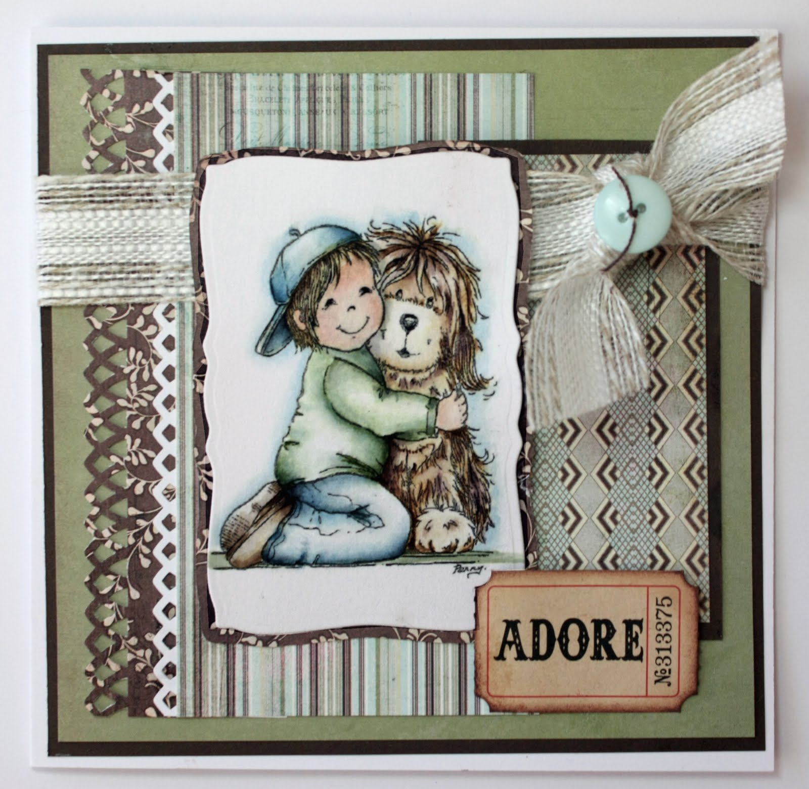
Well - we'll see!!!!!  The card in the middle is ready for embellishing which I hope to finish and post shortly. The Bird Book ? - I was watching some hawk type of birds flying around over the field the farmer is mowing and trying to identify them - as they had forked tails I came to the conclusion they are Kites. No cat again this week - he's out on the balcony, sunning himself.


The tubs are pearls, pear brads and various embellishments. The inevitable coffee cup is there, dangerous really I have been known to knock it over on a finished card - eeeeeeeeek!!!


There's a dragonfly, bottom left, that appeared out of nowhere and I just don't have a home for him, the Tim Holtz distressing tool and some braid left from the card. I did promise a tutorial on braiding, I'd nearly finished it when my computer had hiccups and lost it. I have every intention of finishing it this week. You might also spot a rather large packet of crisps at the top right - my downfall.


My stash cupboards are fairly well organised - a bit untidy but could be worse.

Here is the farmer mowing his grass - not a pretty sight for a hay-fever sufferer, windows will all be closed today, hopefully he'll get his other machine out (haven't a clue what they're called) and hoover up all that grass. I think he stores it as winter fodder for his cows and  this why the Kites were flying about, hoping to spot little mice and voles etc running for cover.


Now I shall go and finish that card and try very hard not to create too much mess - if I didn't make so much mess I'd have more time to visit you all wouldn't I?
Photobucket

Tuesday 15 June 2010

Copic Creations DT

We have another fun challenge for you at Copic Creations this week - colouring on paper other than white. We are sponsored by Stampavie this week so it was a pleasure to get one of  my somewhat neglected Stampavie stamps. The prize is no less that three suprise Stampavie rubber stamps.


I decided to go with a vintage look, I stamped this delightful image (A picnic of Daisies) on Kraft cardstock  with the usual Memento ink. I thought I would have to use darker colours than usual but found I didn't other than the shadows on the skin. Blending was fine, in fact not much different to colouring on normal paper other than just adding a very light touch of Copic opaque white to the hat and parts of the skin just to highlight them slightly.
The bottom two papers are Graphic 45, the script one I ripped and tore - great fun, haven't done that for a while either, then inked the edges. Digging around in my stash I found some lovely bronze corrugated card which I used for the next layer, finally the uppermost layer is form the K&Co pad Bailey. I used Gold stickles on some of the edges, the fabulous lace which I distressed with Vintage Photo ink, was sent from Singapore by my friend Rosey, I used metal corners distressed with Copics and flowers from my stash.


Here is a close up of the image.
I followed the sketch over at Fridays Sketchers and am entering this card into their challenge also and Crafty Angels, although I don't use this stamp very often she has to be one of my favourites, I just love colouring her.
Copics used
Hair  -  Y00/15/17
Skin  -  E00, YR0000, R00, R0, R02
Browns -  E31, E70/71/77
Blues    -  B00/93/95
Greens  -  G000/21/99
Opaque white for highlighting


Finally I made this little one as an experiment. I has some papers left that I had printed out and wonder how would it be to use these. I printed the image (Stampavie's Hoo-hoo-there) on the lighter, slightly patterned paper.
I use 120gms bright white smooth copier paper for printing on - I used to get this at Tesco when in the UK.
Again I used more or less the same colours as I normally would the only thing I found different was the fact blending wasn't quite so easy but I had no problem with bleeding whatsoever. I don't like this card, but I don't really like pink so I wouldn't would I?

Check out my uber-talented teamies creations, they are truly amazing and I do hope you find time to join us in this fun challenge.

Photobucket

Monday 14 June 2010

Clean and Simple

This is my card for Clean and Simple this week. I decided on a Christmas card to get some practice in for when it's almost Christmas and I still have millions of cards to make.  


I used the Snow Dots embossing folder on the left and on the right - the beautiful paper is from Donna's at Bearly Mine's Extreme Designer III CD which you can find HERE
The turquoise cs is from SU and the leaves cut with a Sizzix leaf and branch die. The floral/snowflake centre is a mixture of flowers and die cut snowflakes. The inner snowflake is cut in a pale turqoise mirri card and has a beautiful sheen IRL. The sentiment is  a CC designs  stamp.


That's about it - I shall go and think up a few lies for the award  I got from Sue and Wilma now.

Photobucket

Sunday 13 June 2010

DP2 Challenge card

I've managed to use another of Mo's delightful and as yet unused images, Not many to go now and I'll feel justified in buying more - yippee!! This week for the DP2 challenge it's an easel card.


This was an absolute dream to colour and I've used mixed media - both Copics and distress inks - just felt like experimenting yet again.  The papers are Crafty Indiviuals bp - Trees. I cut the frame with the MS round the page double loops punch - at least I think that's what it called, and the sentiment with Spellbinders fancy tags. Now came the bit I really struggled with - embellishments. I don't usually over embellish Mo's images as I really think they speak for themselves.  For this one I had out flowers, ribbon, pearls, flourishes, punches, corners - you name I had it out - nothing worked and I trashed my room yet again into the bargain.  Then I remembered what an artist friend once told me "A truly gifted artist always knows when to STOP" - that definitely rules me out of the truly gifted status but I did take on board his words took everything off and looked - it didn't really need anything at all, but I couldn't resist adding a couple of flowers either side of the image.

Well I hope you're all having a great weekend and the weather is better where you are than it is here - it's not wet, it's not dry, it's no sunny, it's not dull, it's not warm. it's not cold - it's a NOTHING day!!
Photobucket

Saturday 12 June 2010

Basic Grey DT

We have a Colour Combo at Basic Grey this week chosen by little me. Idiot little me who then struggled to find any turquoise/aqua papers - eeeek!!  I love this colour so much I used them all up but fortunately managed to find the remains of an odd piece of 12"x12" cs called Patchouli from the Romany range. 


I decided I'm fed up with square cards  (fed up with everything this week - fed up with myself truth be known) - anyway I used the Spellbinders Curved rectangles for the base of my card and the various layers. The cream layer I've embossed with the Provocraft Textile folder.  Tilda in Tulle skirt is coloured with Copics, her petticoats and hair bows glittered with Stardust Stickles and sat on some ribbon from stash (I remembered not to have her levitating this time) .I used elements from the Spellbinders Shapeabilities Floral Accents to decorate and finished with flowers from Wild Orchid Crafts and leaves cut with a  CarlaCraft punch. I just wish my brown didn't look so blackish in the photohgraph.

We have a fabulous $25 gift voucher from the one and only Simon Says Stamp so I hope you like my colour choice and that you join us this week at Basic Grey - I look forward to see what you create with it.


hugs all

Photobucket
Related Posts Plugin for WordPress, Blogger...